Pixel Perfect Design 點點設計
Services
Contact
Search
Search
Pixel Perfect Design 點點設計
Search
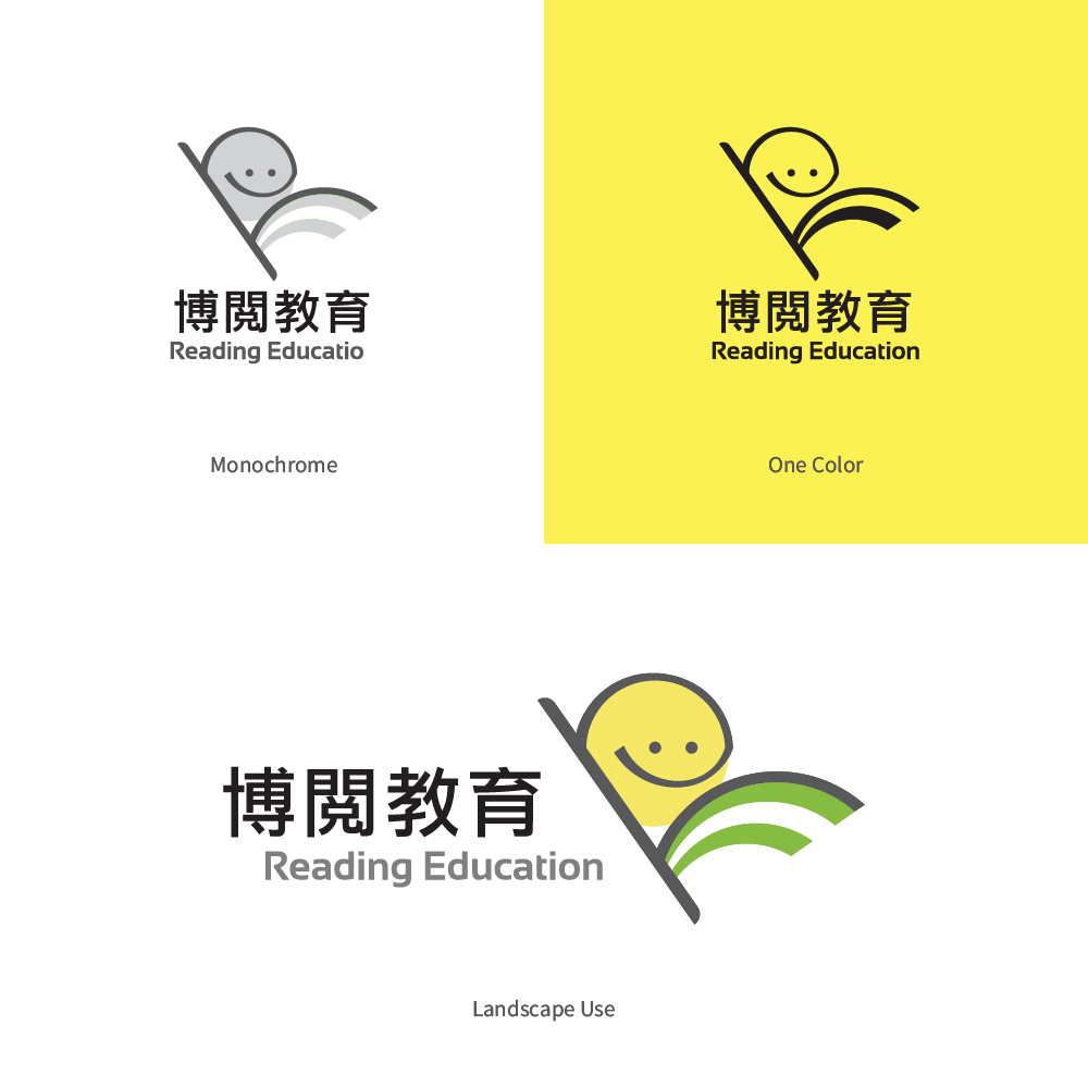
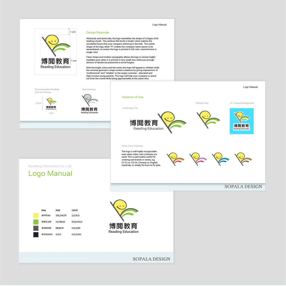
Detailed guidelines on logo adaptation
Reading Education Center
Logo Design
Memorable & Clear Message
A child reading with a smile shows the vision of the company – let children learn through reading happily.
“R” shape logo helps customers remember the company name.
Flexible & Recognizable Design
Clean shape and modern typography which remain highly readable even in small size
Flexibly adaptable to full color, monochrome or single color
Simplistic design, yet enough details to prevent forgery
Fresh Colors with Unlimited Possibilities
Apple green color gives the impression of “fresh” and “energetic”.
Logo details can be changed to different colors for sub-branding, e.g. age groups, course subjects, etc.
Client
Reading Education Ltd.
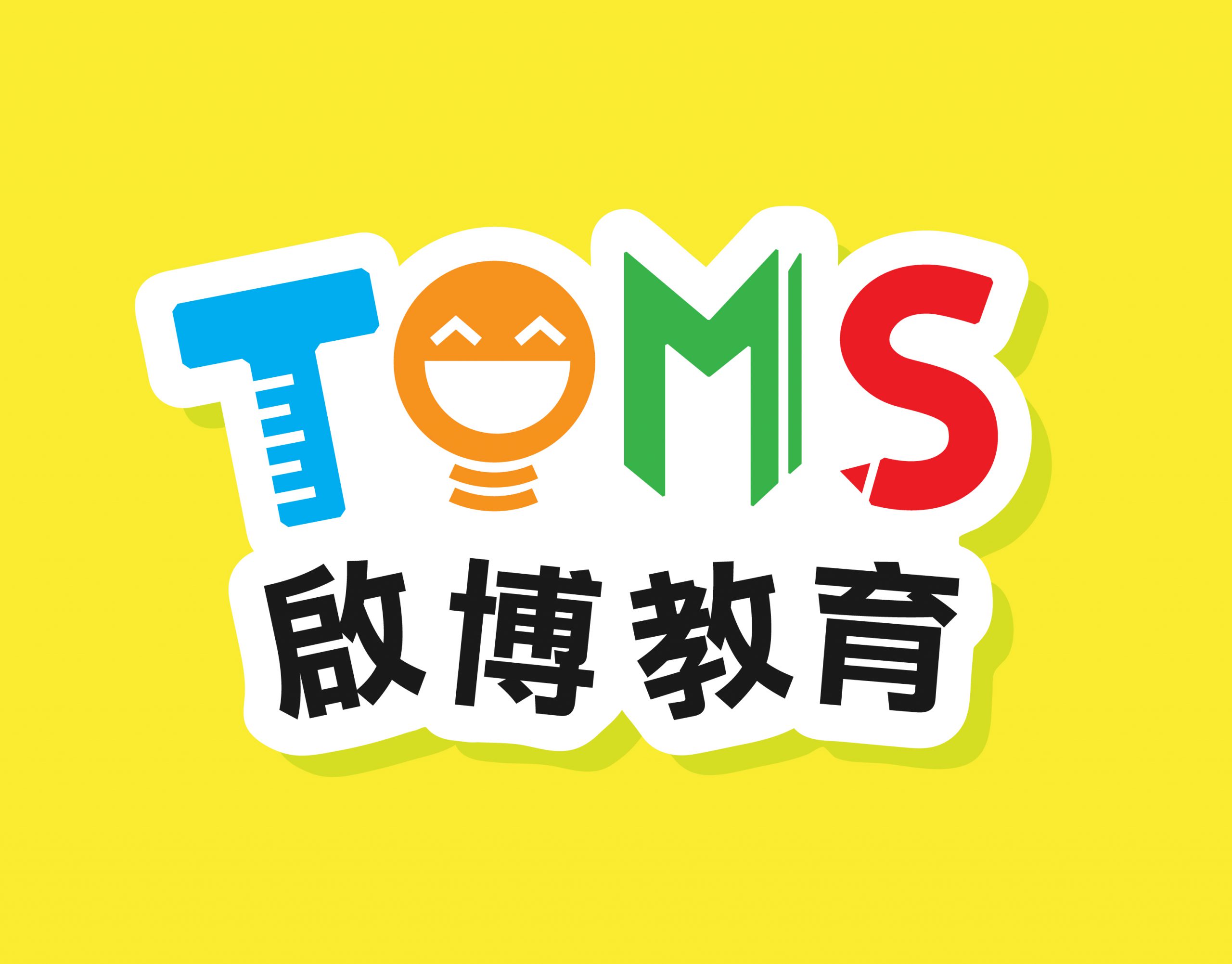
Newer
TOMS Education Center
Back to list
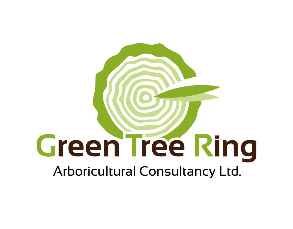
Older
GTR Arboricultural Consultancy
Related projects
View Large
Logo Design
TOMS Education Center
View Large
Logo Design
GTR Arboricultural Consultancy
Search
Start typing to see projects you are looking for.
Services
Contact

